Mapping

What are maps really saying about COVID-19 in Canada?

Canadian Geographic’s cartographer explores how media, scientists and citizens are charting the coronavirus pandemic

  • Published Apr 01, 2020
  • Updated Sep 21, 2022
  • 1,180 words
  • 5 minutes
number of reported Canadian cases of COVID-19 by regional health authority Expand Image
Advertisement

If there’s one thing that’s true about COVID-19, it’s that the scale of direct transmission is local. Which is to say that to acquire the virus you must come in personal contact with it. The safe zone, we are told, is two metres. If you are more than two metres from the virus, you are almost assured not to get it.

And yet, the scale of the virus, over the short time since it has jumped from animals to humans, is also clearly global. And the pathway for this jump from a scale of less than two metres to the scale of the planet is all about the varied nature of modern human movement. Local, regional, national and international travel has moved the virus at an incredible rate from (presumably) a single location to the entire planet.

Visualizing how this world-changing virus has spread is a job cartographers the world over have taken up since the pandemic began. But unlike many geographically-rooted stories, this one is all but impossible to distill into one map. One simply cannot map the transmission from person to person, the journeys of infected peoples around the world and the relative global incidence all at once. There are maps of all kinds circulating around the Internet, using different scales and different cartographic tools to try and answer the myriad questions we are all asking. But not all maps are created equal, and I am going to spend this, and future posts exploring the good, the bad and the ugly of the seemingly endless COVID-19 maps.

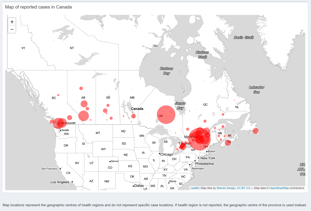
One of the most pressing questions for those of us living in self-isolation is “how likely am I to get COVID-19?” Your own behaviour is, of course, the best defence (wash your hands, don’t touch your face, etc.), but another important consideration is, “does anyone around me have it?” With this question in mind, many of us are turning to online maps, updated daily, to try and make some meaningful assessment of our risk of coming into contact with the virus when we creep out to resupply. The now ubiquitous comparative global maps, showing relative national numbers around the world, are not highly instructive, as Canada is a big place.

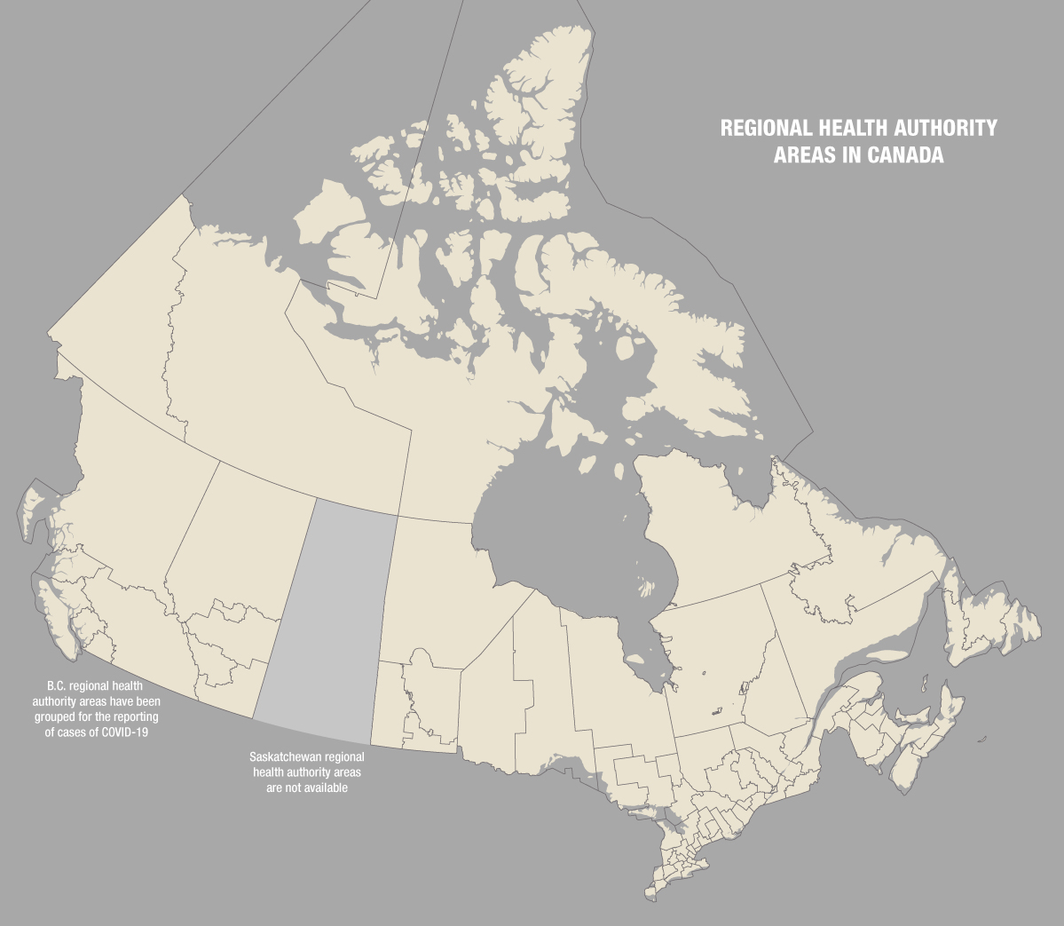
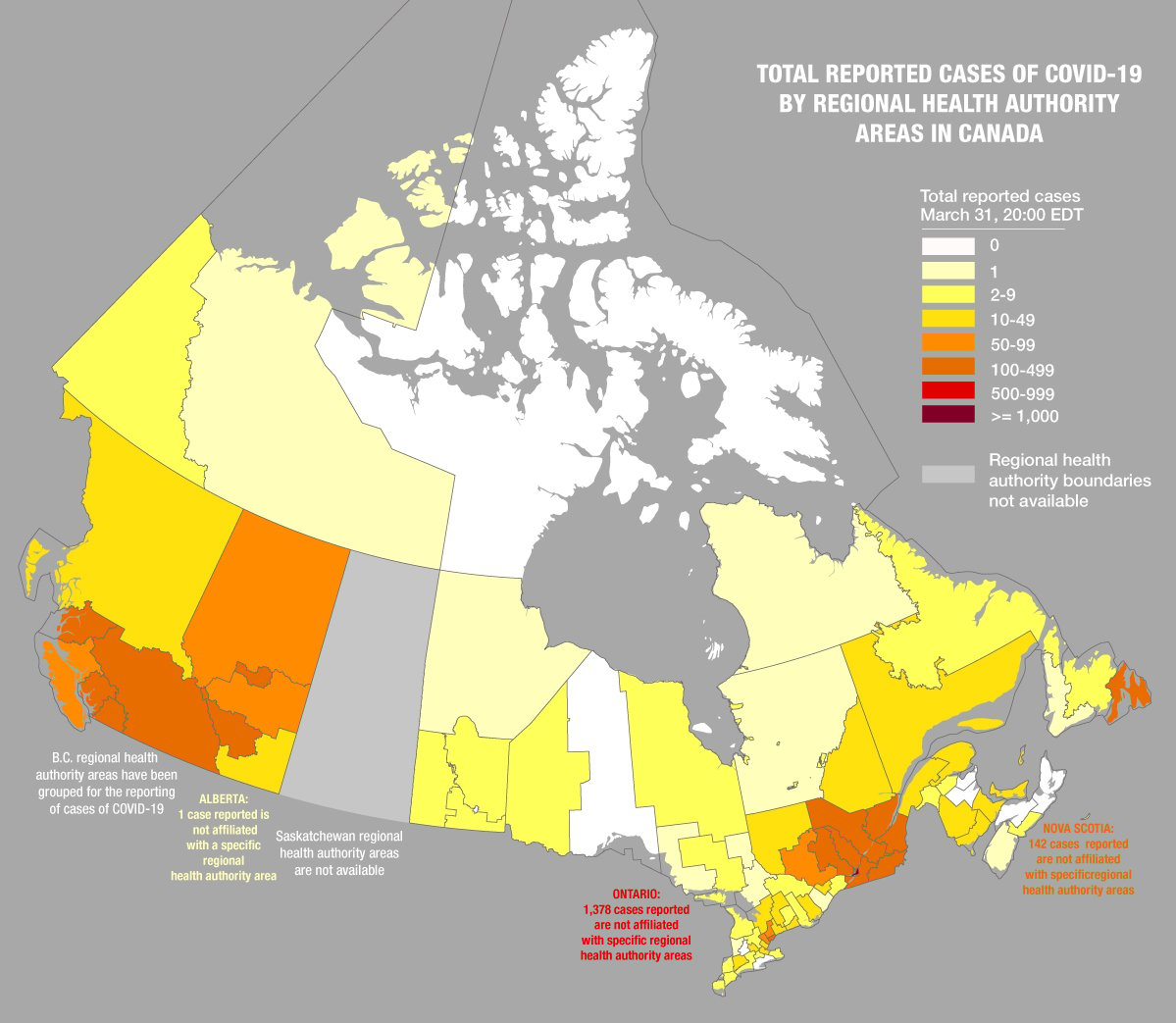
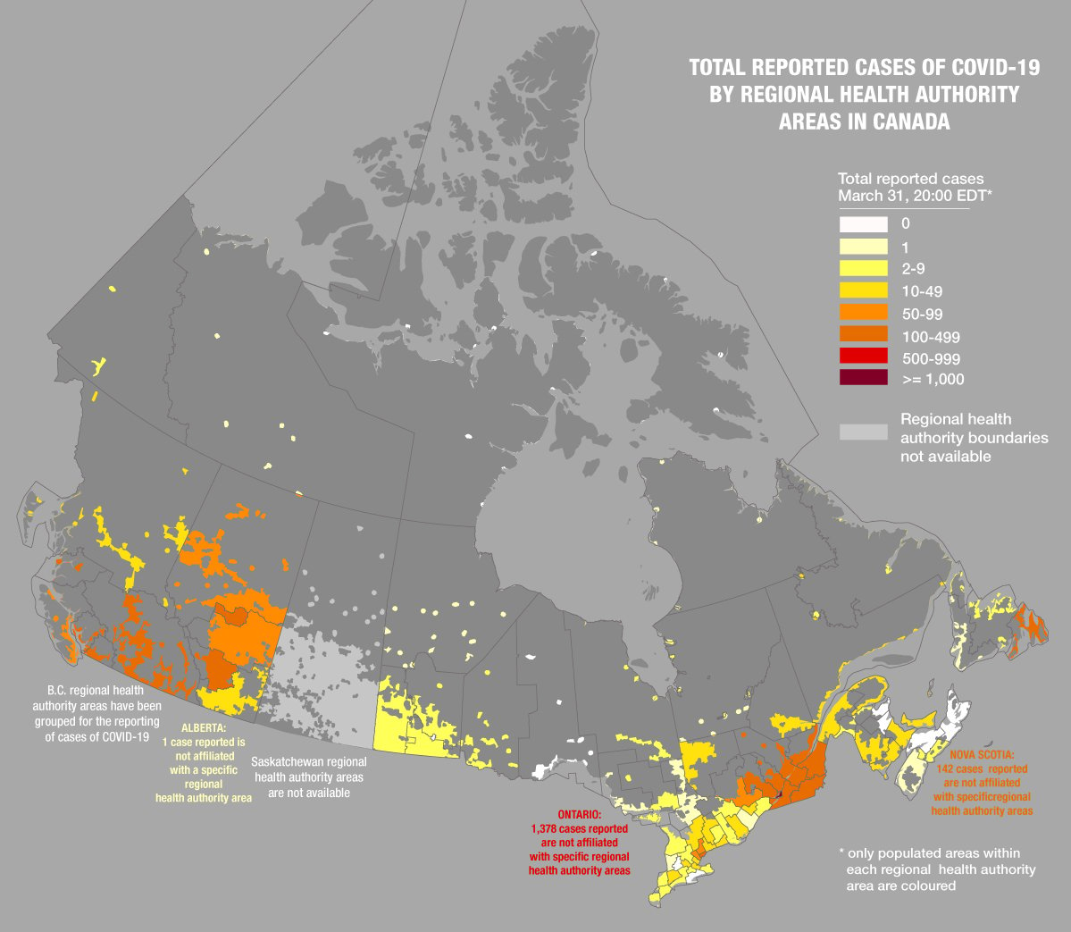
For a nation the size of Canada, breaking down the numbers into more local geographies is necessary. Provincial maps are an improvement, but there is even more granular information available. The numbers of confirmed cases are being collected by provincially managed regional health authorities, and though it would be great to get even more spatially detailed information, it seems that this is the most granular suite of credible data currently available. The regional health authority areas are not well known geographies, so here is what they look like across Canada (note: in B.C. some areas have been merged for reporting purposes during the pandemic, and the Saskatchewan Health Authority has redrawn its boundaries, but are not making the extents publicly available).

Canada's regional health authority areas. (Map: Chris Brackley/Can Geo)
Expand Image

In order to map confirmed cases of COVID-19 in Canada, Jean-Paul R. Soucy and Isha Berry of the Dalla Lana School of Public Health at the University of Toronto, using data curated by the COVID-19 Canada Open Data Working Group, used proportional circle mapping (see below), where each circle is scaled according to the number of cases within each of the regional health authority areas. It is updated daily. 

Canadian COVID-19 case proportional circle map developed by the Dalla Lana School of Public Health, University of Toronto. (Map: Developed by Jean-Paul R. Soucy and Isha Berry, Dalla Lana School of Public Health, University of Toronto. Data curated by the COVID-19 Canada Open Data Working Group) 
Expand Image
Advertisement

It is a very effective map, and gives us the most local view available of what’s happening. But there are a few pitfalls in showing a point location for a region (the centre of the circle represents the centre of the regional health authority area). If one lives in a rural part of the country where the area is large, it is not evident which circle relates to that area. Ultimately, this map would be improved by including these boundaries, as well as the proportional circles. 

A further complication lies in the data itself. Some provinces (notably Ontario) have a large proportion of cases where the regional health authority is not listed, and therefore we cannot know specifically where these cases are from (beyond the fact that they are in Ontario — that’s what the big circle in northern Ontario on the map above represents, not cases in that area per se).

Another cartographic tool that could be used to show this same data is a choropleth map (not, as they are often being called online these days, a “heat map”). Choropleth maps show data based on defined and bounded areas (such as regional health authorities or provinces), whereas heat maps show gradations of information across a continuous and unbounded area (like a grid overlaid on the landscape, where each square has a unique value). While a heat map of the incidence of COVID-19 would be incredibly informative and locally-specific, we simply don’t have easily verifiable data showing how many people have COVID-19 in every specific spot in Canada. What we do have is data describing the total number of reported cases of COVID-19 within each regional health authority. 

Number of reported Canadian cases of COVID-19 by regional health authority. (Map: Chris Brackley/Can Geo)
Expand Image

The map above shows the incidence of COVID-19 with greater geographic specificity than the proportional circle map — so we now know just what geographic area this data is drawn from. However, it admittedly loses some of the comparative proportionality of the proportional circle map, where the big circle representing Montreal demands our attention and is clearly the area with the most cases. This fact is much less obvious in the choropleth map because the physical extent of Montreal is so relatively small. The seven shades of yellow, orange and red are intuitively understandable as more (red) and less (yellow), but the real advantage of this approach is to connect the value (more and less) with the specific area. But the geographic specificity could be even further refined with another simple cartographic technique.

The greatest pitfall in using a choropleth map for human geography in Canada is that our jurisdictions, be they electoral districts or health authorities, are tiny and dense near our generally southern cities, and huge and thinly populated in the North. The result? We get huge swaths of colour in the North representing few people. In this case, five cases of COVID-19 in Nunavut would colour roughly one-fifth of our country with a value that only relates to 1/1000 of our population. So a great technique to mitigate this problem is to keep the boundaries of the health authorities, but only colour the parts of each where people actually live, a technique known to cartographers as the “ecumene.” This dramatically reduces the visual dominance of large unpopulated areas. Here, below, is the same map, with only populated areas coloured.

The number of reported Canadian cases of COVID-19 by regional health authority focusing on the parts of each authority where people actually live. (Map: Chris Brackley/Can Geo)
Expand Image

Of course there are pitfalls here, too. One case in one remote community will cause all of the little pockets of remote communities in that health authority to be coloured, when clearly, only one of them actually has a known presence of COVID-19. Further, the most populous areas (notably Toronto and Montreal), are the smallest in size and don’t have much of a visual impact, despite being where the greatest number of people live. We will look for solutions to this problem (and others) in future posts. Regardless, one thing is clear: cartography can play a very important role in our understanding of the COVID-19 pandemic. 

Advertisement

Are you passionate about Canadian geography?

You can support Canadian Geographic in 3 ways:

Related Content

Assassin's Creed Odyssey landscape

Mapping

Inside the intricate world of video game cartography

Maps have long played a critical role in video games, whether as the main user interface, a reference guide, or both. As games become more sophisticated, so too does the cartography that underpins them. 

  • 2569 words
  • 11 minutes
The War of 1812 giant floor encourages students to interact with history

Kids

Giant floor maps put students on the map

Canadian Geographic Education’s series of giant floor maps gives students a colossal dose of cartography and is a powerful teaching tool

  • 1487 words
  • 6 minutes
The New York Times COVID-19 map

Mapping

Mapping COVID-19: How maps make us feel

Canadian Geographic cartographer Chris Brackley continues his exploration of how the world is charting the COVID-19 pandemic, this time looking at how artistic choices inform our reactions to different maps

  • 1145 words
  • 5 minutes

Mapping

Creative Cartography: Matt Cusick’s map collages

This article is part of a series of Q&As with some of the best artists working with maps. Read…

  • 1186 words
  • 5 minutes